Risk-Benefit Calculator
Understand Your Medication's Benefits
The FDA requires drug labels to show benefit-risk statements. This calculator helps you understand what percentage reductions really mean for your health.
Your Actual Benefit
With this drug, you reduce your risk from to per 1,000 people.
That's an absolute risk reduction.
Risk Comparison
Why this matters: A 50% reduction sounds impressive, but if your baseline risk was very low (like 2 in 1,000), the actual difference is only 1 in 1,000. This calculator shows you the real impact of medication claims.
When you pick up a new prescription, the tiny print on the pill bottle and the thick patient information leaflet might feel like a legal document written in another language. But hidden in that fine print is something crucial: the FDA drug labels’ risk-benefit statement. This isn’t just regulatory jargon-it’s your roadmap to understanding whether the medicine is right for you.
What Exactly Is a Risk-Benefit Statement?
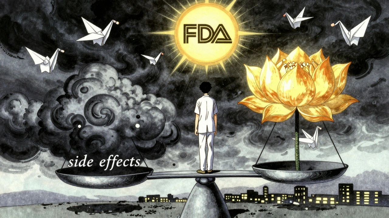
The U.S. Food and Drug Administration doesn’t approve drugs just because they work. They approve them only if the benefits clearly outweigh the risks-for the population the drug is meant to help. That’s the core of a risk-benefit statement. It’s a summary that answers: Does this drug do more good than harm?
These statements are built into every FDA-approved drug label. You’ll find them in Sections 5, 6, 8, and 14 of the official prescribing information. But the most important part? The Highlights section at the top. That’s where the FDA distills the key takeaway: why the benefits were judged to be greater than the risks under the conditions described.
For example, take Jardiance, a diabetes drug. Its label doesn’t just say, “May reduce heart risks.” It says: “In adults with type 2 diabetes and cardiovascular disease, JARDIANCE reduced the risk of cardiovascular death by 38% (10.5% with placebo vs. 6.5% with JARDIANCE).” That’s concrete. You can picture it. That’s what good risk-benefit communication looks like.
Why Most Patients Don’t Understand Their Drug Labels
Here’s the problem: 78% of patients say they want clearer explanations of how a drug’s benefits compare to other treatments. But only 22% feel very confident interpreting the information they’re given. For people with low health literacy, that number drops to 9%.
Why? Because most labels are written for doctors-not patients. They use phrases like “increased risk of hepatotoxicity” or “moderate to severe hypersensitivity reactions.” These aren’t just confusing-they’re intimidating. A Reddit thread with over 200 patient comments called it “medical jargon that makes it impossible to tell if the benefits are even worth it.”
And it’s not just the words. The numbers are often presented in ways that mislead. A drug might say it “reduces risk by 50%.” Sounds great, right? But if the original risk was 2 in 1,000, a 50% reduction means it’s now 1 in 1,000. That’s not a miracle. It’s a small, real change. Experts like Dr. Thomas Fleming have pointed out that this kind of presentation exaggerates perceived benefit-and patients pay the price in confusion.
How the FDA Is Trying to Fix This
The FDA knows this is broken. In 2021, they released a final guidance document laying out how drugmakers should think about benefit-risk assessments. But they didn’t stop there. In 2023, they launched a pilot program requiring six new cancer drugs to include a Patient Benefit-Risk Summary in their labels-written at a 6th-grade reading level, with simple visuals.
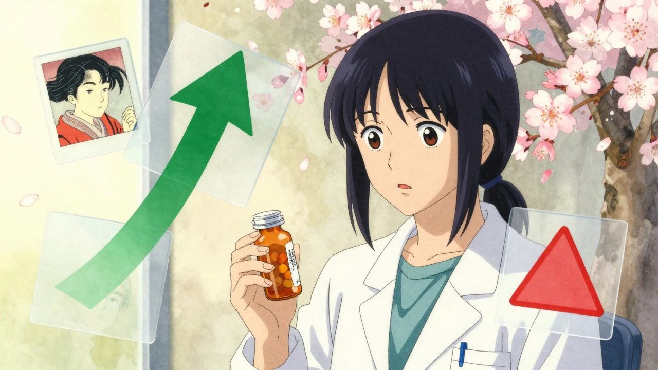
They’re also testing something called “Benefit-Risk Icons.” These are small pictograms-like a scale with a green checkmark for benefit and a red triangle for risk-that show the relative size of each. Imagine seeing a big green arrow pointing up for reduced heart attacks and a small red arrow down for rare kidney issues. No math needed. Just a picture.
These icons are being tested in 12 clinical sites with 1,500 patients. Early feedback? Patients understand them faster and remember them longer than text alone.
What’s Missing From Most Labels
Even with these improvements, most labels still miss the mark in three big ways:
- No comparison to alternatives. If you’re choosing between two drugs, the label rarely says, “This one lowers blood pressure more than Drug X, but causes more dizziness.”
- No personalization. A label talks about “the intended population.” But what if you’re 78, have kidney disease, and take six other pills? Your risk profile is different.
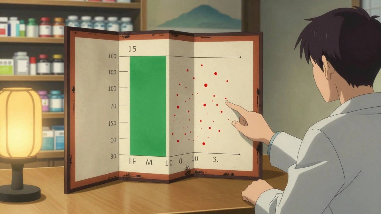
- No visual context. Numbers on paper mean little without a way to see them. A 15% reduction in stroke risk sounds abstract. A bar chart showing 15 out of 100 people helped? That sticks.
The European Medicines Agency (EMA) and the UK’s MHRA have used patient preference studies for years-asking real people: “How much risk are you willing to take for this level of benefit?” The FDA has only started doing this for breakthrough therapies. But it’s a step in the right direction.
How to Read Your Own Drug Label (Even If It’s Bad)
You don’t have to wait for the FDA to fix everything. Here’s how to make sense of your label today:
- Start with the Highlights. Look for the sentence that says, “Benefits outweigh risks because…” That’s the FDA’s bottom line.
- Find the numbers. Look for percentages tied to real outcomes: “reduced heart attacks by X%,” “1 in 100 experienced Y side effect.” Avoid vague phrases like “may cause” or “some patients report.”
- Compare to what you know. If you’re on a new drug for high blood pressure, ask your doctor: “How does this compare to the one I was on? Is it better at preventing strokes? Worse for my kidneys?”
- Ask for a visual. Tell your pharmacist or doctor: “Can you show me a simple chart of the benefit versus risk?” Many now have printed visuals or apps to help.
- Check the source. Go to Drugs@FDA (FDA’s public database) and download the full label. It’s free. You don’t need a degree to read it-just patience.
Why This Matters More Than Ever
Today, more drugs are being approved faster-especially for serious illnesses like cancer, rare diseases, and mental health conditions. That means the balance between benefit and risk is tighter. A drug might extend life by a few months but cause severe fatigue. Is that worth it? Only you, with your doctor’s help, can decide.
That’s why the FDA is pushing for patient-centered labeling. The 21st Century Cures Act and FDA Reauthorization Act made it clear: patients aren’t just passive recipients of medicine. We’re partners in the decision.
And the market is responding. Sixty-eight percent of top pharmaceutical companies now hire “patient communication specialists”-a job that didn’t exist a decade ago. They’re rewriting labels, designing icons, and testing how real people understand risk.
What’s Coming Next
By 2025, the FDA plans to require standardized, quantitative benefit-risk metrics for major drug categories. That means consistent ways to measure and compare benefit and risk across different diseases. By 2026, nearly half of all new drug labels are expected to include visual summaries.
It’s not perfect yet. But progress is happening. And it’s happening because patients spoke up.
When the FDA asked for feedback on drug labels, over 1,200 patients said: “Show me the numbers. Show me the trade-offs. Don’t make me guess.” And now, slowly, they’re listening.
What is the purpose of a risk-benefit statement in FDA drug labels?
The purpose is to clearly explain why the FDA believes the health benefits of a drug outweigh its potential harms for the intended patient group. It helps doctors and patients make informed decisions by showing the balance between what the drug can do (like reduce heart attacks or slow disease) and what it might cause (like side effects or rare serious reactions).
Why are FDA drug labels so hard to understand?
Most labels were written for medical professionals using technical language, complex statistics, and vague terms like “may cause” or “some patients.” They often focus on population averages, not individual needs. Only 22% of patients feel confident understanding them, and that number drops sharply for those with low health literacy.
How can I tell if the benefit of my medication is worth the risk?
Look for specific numbers in the Highlights section: “reduced risk of X by Y%” or “Z out of 100 people experienced side effect.” Ask your doctor: “Compared to other options, how much better is this drug at preventing serious outcomes? What are the most common side effects, and how likely are they?” If you’re unsure, ask for a visual summary or a printed chart.
Are visual aids like icons actually helpful?
Yes. Early tests show that simple icons-like a scale with a green arrow for benefit and red for risk-help patients understand trade-offs faster and remember them longer than text alone. The FDA is testing these icons in clinical settings and plans to expand their use. They’re especially useful for people who struggle with numbers or medical terms.
What’s the difference between FDA and EMA risk-benefit approaches?
The FDA uses a flexible, qualitative framework focused on context and clinical importance. The European Medicines Agency (EMA) uses a more structured, quantitative method called PrOACT-URL, which includes patient preference data. The EMA’s approach worked well during the COVID-19 vaccine rollout, where clear risk-benefit visuals helped the public understand rare side effects. The FDA is now moving toward more patient input and visuals, but it’s still catching up.
Where can I find the official FDA label for my drug?
Go to Drugs@FDA (https://www.accessdata.fda.gov/scripts/cder/daf/) and search by drug name. You can download the full prescribing information, including the Highlights section and detailed benefit-risk summaries. It’s free, official, and updated regularly.
What to Do Next
If you’re taking a new medication, don’t just accept the label as-is. Ask your doctor or pharmacist: “Can you explain the benefit-risk balance in simple terms?” Bring a printed copy of the label. Point to the numbers. Ask for a chart. If you’re not satisfied, request a patient-friendly summary from the pharmacy.
And if you’re a caregiver, advocate, or patient leader-speak up. The FDA still takes public comments. Your voice helps shape the next generation of labels. Because better communication isn’t just about clarity. It’s about control. It’s about being able to say, “I understand what I’m signing up for.” And that’s not just good medicine. It’s basic respect.
Ben Choy
December 5, 2025 AT 17:56Finally, someone wrote this in a way that doesn’t make me feel like I need a medical degree just to take a pill. I’ve been on statins for 5 years and never knew how to read the label-just trusted my doctor. But after reading this, I went to Drugs@FDA and actually looked at the numbers. Turns out, my risk of a heart event dropped from 12% to 10% over 5 years. Not magic. Just math. And now I feel like I’m part of the decision.
Emmanuel Peter
December 6, 2025 AT 18:53LOL at the FDA trying to 'fix' this. They’ve been selling snake oil for decades and now they want to put cute icons on it? The real problem is they approve drugs based on surrogate endpoints, not actual outcomes. A drug that 'reduces LDL by 40%' doesn’t mean you live longer-it just means your cholesterol numbers look pretty. They’re not fixing the system, they’re just putting lipstick on a pig.
Ashley Elliott
December 8, 2025 AT 16:17I love that they’re testing icons. I’m a nurse, and I’ve seen so many elderly patients just nod along because they’re too scared to admit they don’t understand. One lady cried because she thought 'hepatotoxicity' meant her liver was going to explode. If a picture of a liver with a red X and a green check for benefit helps even one person sleep better at night? Worth it. Let’s scale this fast.
Chad Handy
December 8, 2025 AT 18:51You know what’s worse than confusing labels? The fact that Big Pharma pays for the entire process. The FDA doesn’t test these drugs-they just rubber-stamp whatever the company submits. I read a study where a drug was approved because it 'reduced hospitalizations by 18%'-but only 27 people were in the trial. And the side effects? They were classified as 'mild' even though half the patients quit because they were dizzy 24/7. This isn’t transparency. It’s marketing dressed up as science. And now they want to make it prettier with little arrows? Please. The system is broken at the root.
Augusta Barlow
December 10, 2025 AT 15:05Icons? Really? The FDA is just trying to distract us. Did you know the same companies that make these drugs also design the icons? And the 'patient-friendly' summaries? They’re written by PR teams with PhDs in psychology. I’ve seen the drafts-every risk is buried under three layers of positive spin. The real danger isn’t the jargon-it’s that we’re being manipulated into thinking we’re being informed. This isn’t patient empowerment. It’s cognitive dissonance with a color palette.
Joe Lam
December 11, 2025 AT 02:26Look, I get it-patients want simple answers. But medicine isn’t simple. You can’t reduce a 300-page clinical trial into a cartoon. If you dumb it down too much, you lose nuance. A 50% risk reduction means nothing if the baseline risk is 0.01%. You’re not helping people-you’re creating false confidence. The FDA should stop pandering and just require doctors to explain it in person. That’s what we’re paid for.
Jenny Rogers
December 12, 2025 AT 17:51One must contemplate the ethical imperative underlying this discourse: the epistemological asymmetry between the medical establishment and the layperson. The FDA’s proposed icons, while aesthetically pleasing, constitute a form of epistemic paternalism-imposing simplified narratives upon individuals who, by virtue of their autonomy, deserve access to the full ontological weight of the data. To reduce risk to a pictogram is to commodify consent. One must ask: Is this patient empowerment-or infantilization dressed in green arrows?
Rachel Bonaparte
December 13, 2025 AT 14:57Okay, I’ll admit-I used to think this was just bureaucratic nonsense. But then my mom got prescribed that new Alzheimer’s drug. The label said 'moderate cognitive improvement'-but didn’t say how much. I called the pharmacy, asked for the actual numbers, and they sent me a one-pager with a bar chart showing 3 out of 10 people saw slight improvement, and 1 in 5 got severe nausea. That’s the stuff they should give everyone. Why make us dig? If the FDA can do this for cancer drugs, why not everything? I’m tired of feeling like I’m playing Russian roulette with my meds.
Chase Brittingham
December 14, 2025 AT 21:24My dad’s on five meds. He doesn’t read anything. But when I printed out the FDA label with the benefit-risk icons from the pilot program, he actually asked questions. Like, 'Wait, so this one helps me walk better but makes me dizzy?' And then he said, 'I’ll take it if the dizzy part is rare.' That’s the moment you realize-people aren’t dumb. They’re just not given the tools. This isn’t about dumbing down. It’s about leveling up. Let’s make this standard. Everywhere. Now.
Ollie Newland
December 16, 2025 AT 04:54As someone who’s worked in pharmacovigilance, I’ve seen the data. The real win here isn’t the icons-it’s the shift toward patient preference studies. The EMA’s PrOACT-URL model isn’t perfect, but it forces companies to ask: 'What trade-offs do patients actually value?' For example, in MS treatments, patients consistently trade higher risk of infection for better mobility. That’s not something a doctor can assume. If the FDA starts mandating that, we’ll finally have personalized benefit-risk, not population averages. That’s the future.
Rudy Van den Boogaert
December 17, 2025 AT 17:10Just wanted to say-this is the best breakdown I’ve ever read. I’m a single dad with type 2 diabetes. I used to just take whatever the doctor handed me. But after reading this, I went to Drugs@FDA and found the Jardiance label. Saw the 38% reduction in cardiac death. Then I looked up my own risk based on age, weight, and HbA1c. Turns out, my personal benefit is closer to 25%. Still worth it, but now I know why. I showed my kid the chart. She said, 'So it’s like a video game-health points vs. damage?' I laughed. But then I cried. Because for the first time, she gets it. And so do I.